Why the Design Phase is Crucial in Animation Production: A Creative Director's Perspective

Hand holding piece of candy

In the ever-evolving world of animation, it’s tempting to dive straight into production as soon as the script is ready. However, one of the most critical yet often overlooked stages of creating impactful animations is the design phase. At Watts, we’ve worked on animation projects for a range of clients with diverse needs, and one thing remains true: the importance of carefully crafting a visual narrative before production begins.

Design: The Secret Sauce in Storytelling

The design phase is where the magic of visual storytelling begins. It's about more than just picking colors or designing characters—this is where the tone, style, and overall aesthetic are established. Essentially, it's the DNA of the animation. Clients often focus on scripts or jump straight to storyboards, but without a well-thought-out design phase, the narrative can lose its spark.

Choosing the right visual approach is as critical as the story itself. A graphic vector style offers clean lines and bold colors, delivering a modern, minimalistic feel—perfect for tech brands or explainer videos where simplicity is key. This style tends to be more budget-friendly and quicker to produce compared to more complex techniques.

In contrast, using 3D with photorealistic elements immerses viewers in a highly detailed world, making it ideal for product demos or industries requiring realism, such as architecture or automotive. However, this comes with higher production costs and longer timelines due to the intricate rendering involved. Each style not only tells a unique story but also carries its own intrinsic time and budget factors. Managing these expectations early on can make all the difference in keeping a project on track.

On-Brand and On-Point: Why Consistency Doesn’t Mean Boring

At the heart of successful animation is not just storytelling but brand storytelling. During the design phase, we ensure that every visual element aligns with the client's brand guidelines while still pushing creative boundaries. This balance is crucial for producing animations that feel fresh and innovative, yet consistent with a brand’s identity.

For example, a hand-drawn animation brings charm, personality, and warmth, which works well for brands looking to create emotional connections with their audience. This style can be labor-intensive, though, so factoring in time and resources during the design phase helps avoid production delays.

Alternatively, a mograph spot—with clean lines, typography, and simplified shapes—provides a dynamic way to break down complex concepts without breaking the bank or schedule. Choosing the right approach during the design phase ensures you stay on brand, meet your goals, and don’t encounter costly changes later in production.

The Early Bird Gets the Approval: Client Buy-In Saves Time and Money

When working with clients who have multiple stakeholders, getting everyone on the same page early is essential. The design phase is your chance to achieve this buy-in, preventing costly changes down the line. Think of it as a creative insurance policy—agreeing on the design direction upfront saves time, reduces rework, and keeps production on track (and on budget).

For example, deciding early between a 2D flat animation (which is quicker and more cost-effective) versus a 3D character-driven animation (which can create emotional engagement but requires more time and investment) allows clients to understand the trade-offs and make informed decisions. Once production begins, changing the visual approach can dramatically impact both the timeline and the budget, so nailing down design early streamlines the process.

Fuel the Creativity, Cut the Chaos

A well-executed design phase is like giving your team a creative GPS. It sets clear visual guidelines that streamline production, reducing the chances of detours and dead ends. By making design decisions upfront, you avoid ambiguity, minimize revisions, and keep the creative juices flowing without unnecessary chaos.

For instance, choosing a cel-shaded style that mimics the look of traditional hand-drawn animation can offer a fun, retro aesthetic, but it’s also faster to produce than fully rendered 3D worlds. Knowing this from the outset helps set realistic expectations for both the client and the production team.

By managing the design phase smartly, you also keep your team motivated and on track, preventing burnout from endless revisions. This thoughtful management ultimately results in happier clients, smoother workflows, and a stronger final product.

Final Thoughts: Don’t Short-Circuit the Design Phase

The design phase is a vital investment in the success of any animation project. It's where creativity meets strategy, ensuring that the final animation is not only visually compelling but also aligned with the client’s goals, brand identity, and budget. Whether you're aiming for a sleek vector animation, a detailed 3D world, or an artistic hand-drawn aesthetic, each approach tells a different story and comes with its own set of time and cost implications. Managing these variables smartly not only delivers better results but also keeps your team and clients happy throughout the process.

At Watts, we champion a thorough and thoughtful design process because we know it pays off in the quality of the final product. Looking to amp up your brand’s storytelling through animation? Let’s start with a solid design foundation and bring your vision to life in a way that truly resonates—on time and on budget.

For mote thoughts on how to design your typography, read Sean’s article on www.shots.net.

The Ultimate Guide to Selecting the Best Video Production Company for Your Needs

In today's digital landscape, video content has emerged as a powerful tool for businesses and individuals alike to connect with their audiences, convey messages effectively, and achieve marketing objectives. Whether it's captivating storytelling, engaging product demonstrations, or informative tutorials, video has become an indispensable part of modern communication strategies.

With the demand for video content on the rise, many organizations and individuals find themselves in need of professional assistance to bring their visions to life. This is where choosing the right company becomes paramount. From creating memorable advertisements to producing engaging corporate videos and compelling documentaries, the expertise and creativity of a professional production team can make all the difference.

However, navigating the sea of video production companies can be daunting, especially for those unfamiliar with the industry. With countless options available, how do you ensure that you're selecting the best partner to meet your specific needs and objectives? In this comprehensive guide we’ll explore the key factors to consider so you can make an informed decision when choosing a video production partner that aligns with your vision, budget, and project requirements.

A crew of 4 people films a man standing on a VR stage


Define Your Goals and Budget

Identify the purpose and objectives of your video

  • Clearly define the purpose of your video, whether it's to increase brand awareness, educate your audience, promote a product/service, or something else.

  • Set specific, measurable goals such as increasing website traffic, boosting conversions, or generating leads.

  • Understand your target audience and crafting messaging that resonates with them.

Set a realistic budget based on project requirements and goals

  • Consider the complexity of your project, such as location shooting, special effects, or talent fees.

  • Research industry standards for video production costs to ensure your budget is realistic.

  • Allocate funds for post-production tasks like editing, color grading, and sound design.

Communicate your goals and budget clearly

  • Clearly articulate your project goals, target audience, and any specific requirements.

  • Provide a detailed breakdown of your budget and discuss any flexibility or constraints.

  • Be open to suggestions from production companies on how to maximize your budget while achieving your objectives.

Assess Experience and Expertise

Review the company's portfolio and past projects

  • Look for diversity in their portfolio, including different styles, genres, and industries.

  • Pay attention to the quality of their work, production values, and storytelling ability.

  • Consider whether their past projects align with your vision and objectives.

Evaluate their experience in your industry or niche

  • Choose a production company that has experience working in your industry or a similar niche.

  • They should understand your target audience, messaging, and industry-specific requirements.

  • Ask for case studies or references from clients in your industry to gauge their expertise.

Check for specialized skills and expertise relevant to your project needs

  • Depending on your project requirements, look for companies with expertise in areas like animation, motion graphics, live action, or documentary filmmaking.

  • Assess their proficiency in using specific tools or software relevant to your project.


A man holds a camera slate in front of an interviewee

Evaluate Creativity and Style

Examine the company's storytelling capabilities and creative approach

  • Look for creative agencies that can tell compelling stories that resonate with your target audience.

  • Consider their ability to evoke emotions, create memorable visuals, and convey your brand message effectively.

  • Review their creative process, from concept development to scriptwriting and storyboarding.

Assess their ability to tailor their style to match your brand identity

  • Choose a production company that can adapt their style to align with your brand's tone, voice, and aesthetic.

  • Look for examples where they successfully integrated branding elements into their videos while maintaining authenticity and creativity.

  • Discuss your brand guidelines, messaging, and visual identity to ensure alignment with the production company's creative vision.

Look for innovation and fresh ideas in their previous work

  • Seek out production companies that are innovative and stay updated on industry trends.

  • Look for examples where they pushed creative boundaries, experimented with new techniques, or incorporated innovative storytelling formats.

  • Consider how their creative approach can differentiate your video content and make it stand out in a crowded marketplace.

Technical Proficiency and Equipment

Ensure the company utilizes high-quality equipment and technology

  • Check if the production company uses professional-grade cameras, lenses, lighting equipment, and audio gear.

  • Inquire about their post-production capabilities in the areas such as, editing, visual effects, motion graphics, compositing, 3D, color grading, and sound design and mixing.

  • Ask how the production company stays updated on the latest technological advancements in video production to deliver the highest quality results.

A crew films a man standing on a sound stage

  Check for proficiency in various video production techniques

  • Assess their expertise in cinematography, including framing, composition, and camera movement.

  • Look for skilled editors who can seamlessly integrate footage, music, sound effects, and visual effects to enhance storytelling.

  • Consider their proficiency in other production techniques such as motion graphics, animation, or drone videography if relevant to your project.

Verify their ability to handle any specific technical requirements of your project

  • Discuss any specialized technical requirements of your project, such as shooting in different locations, capturing aerial footage, or using virtual reality technology.

  • Ensure the production company has the necessary expertise, equipment, and resources to meet these requirements.

  • Ask for examples of similar projects they've completed to gauge their ability to handle technical challenges effectively.

Consider Client Testimonials and Reviews

Read testimonials and reviews from past clients

  • Look for testimonials and reviews on the company's website, social media profiles, or third-party review platforms.

  • Pay attention to feedback related to communication, professionalism, reliability, and the quality of their work.

  • Reach out to past clients directly for more detailed insights into their experience working with the production company.

Seek recommendations from industry peers or professional networks

  • Ask for recommendations from colleagues, industry associations, or networking groups.

  • Seek referrals from professionals who have firsthand experience working with video production companies.

  • Consider joining online communities or forums where industry professionals share recommendations and insights.

Pay attention to the company's reputation for reliability, communication, and client satisfaction

  • Research the company's reputation and track record in the industry.

  • Consider factors such as response time to inquiries, ability to meet deadlines, and willingness to address client feedback.

  • Choose a production company known for fostering positive client relationships and delivering exceptional customer service.

Selecting the right video production company is a crucial step towards achieving your marketing and communication goals. With careful consideration and thorough research, you'll be able to choose a video production company that not only delivers high-quality results but also understands your vision and collaborates effectively to bring it to life. So, whether you're aiming to promote a product, tell a compelling story, or raise awareness about an important cause, investing in the right video production partner can make all the difference in achieving success in today's competitive digital landscape.

Go to our blog for more industry-related content.

To learn more about Watts and the work we do, please visit our website or send us a note to hello@wearewatts.com.

Transforming Text: Type-Driven Strategies for Social Success

It’s rare for a broadcast commercial to make the leap to social without serious alterations.

What looks great on TV can look like a cluttered mess on Instagram. From a technical point of view, there are extremes in real estate to work with – you’re not usually locked into thinking in a 16x9 aspect ratio like you would for TV. As advertisers debate what makes the biggest impact on social media, the fundamentals of type and motion design can be the powerful hook needed to get an idea across in a landscape overwhelmed with competing messaging.

A less-is-more approach typically wins the day – think simple, clever, typographic animations – and as a result, the art of typography design is enjoying a bit of a renaissance.

When Type is Right

How do you know when a type-driven approach makes sense? When type is already the focal point of a larger campaign, embrace and deconstruct it into short ads. This is especially true when you strive for quick brand awareness. Strong Sans-Serif typefaces make the easiest quick reads. Color is also critical and can go from both extremes. 

While bright, multi-colored backgrounds jump, also consider muted palettes to allow the type to cleanly and elegantly present the message. 

Verizon’s 5G Network launch is easy to read on the small screen and has immediate brand recognition. The font, colors, and layout closely follow brand guidelines while making use of punchy kinetic typography blended with 3D animation.

Above: Verizon’s 5G Network launch.

Keep It Simple

Visa’s “Money is Changing” campaign examines everything from dating norms and marriage to salary disclosures and the pay gap. It pops on social with simple type layouts, a bold retro color palette, and personal touch.

Attention spans on social media can come down to a matter of seconds. Try not to burden the viewer with extra frills. By stripping down everything but the message itself, you can elicit an emotional response.

Above: Airbnb and Stance’s clever text.

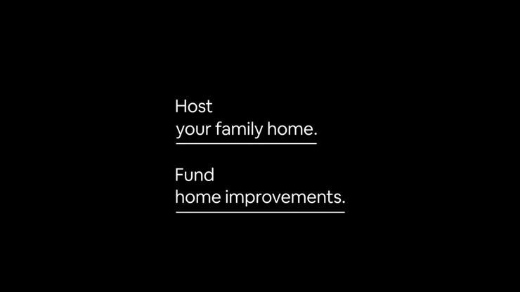
Airbnb has done this effectively with a series of type-only ads that play Mad Libs with your life, property, and finances. Using a simple slot-machine animation, it stands out as a fun and playful way to show the story of being an Airbnb host. It also lets you focus on the emotional element of what it can actually mean to you.

Make It Move

Kinetic type animations can be the best attention grabbers. Set the tone and bring a sense of artistry by pushing the limits of what the type-form can do with energy and movement. This can be accomplished with different techniques, such as animating whole words into place or playing with the structure of the letterform. The fonts themselves can also be used as a dynamic container for the action.

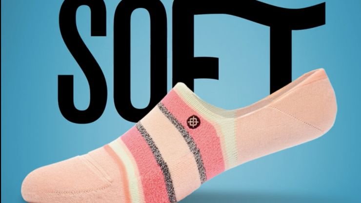
Stance’s bright and colorful series of ads present the product against prominent and playful type animations that take on the character of its clothing. Have fun manipulating the typeface itself with simple metaphoric animations.

Above: DIA Studio’s Nike Basketball Illustrations.

DIA Studio created an amazing black-and-white series of looping type animations for Nike Basketball. With a simple, stark type, it’s hypnotic and eye-catching.

Beats by Dre brings us BeatsX with strong kinetic type over footage that’s bright, colorful, and memorable. Even with sound off, the feeling of movement and music is conveyed at a glance. 

Fonts can be used as a dynamic container for action.

Red Bull Radio is a web-based radio station offering eclectic programming, interviews, and music. This bold type animation made the announcement for the 'Peak Time' radio show. Lots of upbeat dynamism and very on-brand for a show that featured lively interviews with the artists and tastemakers pushing culture forward. With abrupt action and sparse compositions, it accomplishes a retro-print-meets-stop-motion effect that is a perfect vehicle for its content.

Woman in gray suit dancing.

This animated social series for Nike’s 270 and VaporMax shoes [above] pushes letterform weights in amazing and unexpected ways. When the type is used alone, it tells a powerful story about movement. When it’s integrated with photography, the flowing structure of the typeface becomes part of the story itself. 

A type-driven approach to your social strategy can be very effective at driving brand awareness, engagement, and shareability. As seen in all of these examples, a type-driven approach to your social strategy can be very effective at driving brand awareness, engagement, and shareability. 

For us designers, this presents a real opportunity -- and open playground -- to explore fresh approaches unhindered by the expectations of more traditional ad campaigns.

This article originally appeared on Shots.

If you want to reach out to us, just send an email to hello@wearewatts.com. Or if you’re curious to see our work, you can view it through our homepage.

Employee Spotlight with Our Creative Director, Sean Koriakin

In an industry with constantly evolving trends and technology, Watts Media Creative Director Sean Koriakin continues to emphasize the value of authentic storytelling, whether through animation or live-action, and the essential human touch at the heart of every project. This compelling conversation offers a rare glimpse into the mind of a creative maestro who, despite the industry's pressures, remains firmly rooted in the belief that true success lies in capturing the soul of a story.  

From RISD to Watts 

Detailing his background, Sean reminisces about his time at the Rhode Island School of Design (RISD), where he started with a penchant for fine art painting. However, his love for animation soon took precedence.   

After receiving his diploma, like many post-graduate students, Koriakin found himself lost in Los Angeles, unsure of what would come next. He soon secured himself a position as an intern at the renowned agency, Imaginary Forces.   

Men sitting on a movie set


“I was there as an intern at first, an animator, and basically worked my way up as an art director over there for six years…” Koriakin reflected. “...That’s the real school, Imaginary Forces, and learning how to do production at a high level.”  

 Wanting to embark on a new chapter, Koriakin bid farewell to Imaginary Forces and co-founded the creative studio Iron Claw. “We worked that for 7 or 8 years and had a pretty successful run in that company; it was an extension of kinds of projects we were doing at Imaginary Forces, but with it’s own flair,” he said of the experience.   

 After nearly two accomplished decades in LA, Koriakin was looking for a change, and he and his wife transitioned to Seattle. There, he found his stride as an animation director at Vossler and then at Watts Media, Inc. as Creative Director. 

Currently settled at Watts, Koriakin expressed, “this is more in line with the stuff I was doing but with a Seattle twist…here there’s more understanding of the brand and story of the people, instead of just the visual output.” 

A Milestone Moment 

Iron Claw experienced a meteoric rise, boasting partnerships with industry giants such as EA, Saatchi and Saatchi, and Direct TV, among others. However, a particular achievement stands out in Koriakin's career, one he nearly overlooked. 

In 2010, Iron Claw was hired by NBC Sports to shoot and design the Sunday Night Football Open with Faith Hill. Describing the endeavor, Koriakin noted, “[we] did this really colorful journey through Americana with these sort of hyper-real painterly scenes.” This venture was critically acclaimed and culminated in an Emmy nomination for Iron Claw. Riding on this success, NBC Sports engaged them for a repeat performance the subsequent year. 

Peyton Manning on green screen

Sean Koriakin and Peyton Manning for NBC Sports.

2011 became an even more significant year for Koriakin. He clinched the Emmy for Best Creative Direction, an achievement he discovered most casually. “I didn’t even know I won or was nominated until a friend of mine was like, 'oh hey, they said your name at this thing; I think you won,’” Koriakin amusingly recollected. “That was pretty cool, and I just didn’t know that there were people who could appreciate the kind of stuff we were doing.” 

Reflecting on this unexpected honor, Koriakin viewed it as an award and a pivotal moment of recognition. “It’s corny now that I think back on it, I think that was a cool moment of just feeling that my work was accepted by peers,” he shared. 

Career Highlights 

Despite having such an exciting and accomplished professional background, Koriakin would say the highlight of his career is yet to come, “I think the highlight of my career is still going to happen.” 

Koriakin attributes it to getting older and the drive being less about his career and more about the projects themselves, “I’ve gotten away from that kind of thinking and moved towards…trying to create every project with the best intentions behind the subject matter.”  

Among his diverse portfolio at Watts, the Xbox’s Forza Motorsport Blind Driving Assists project holds a special place in his heart. It wasn’t its aesthetic appeal that stood out but its profound narrative. “Not because it was, say, the most visually impressive or had the best design, but it was a chance to tell a good story and connect with that subject matter,” Koriakin stated. He further elaborated on its significance, “...it made me feel way better than winning an Emmy for Sunday Night Football; it just felt like a real difference, like contributing something helpful to the world through my work.” 

Man sitting in chair

Adapting to an Evolving Landscape 

In this age of swift technological progression, Koriakin emphasizes the importance of staying updated. "I think my goals are to keep up with what's going on and make the best stuff with the current set of stuff that's out there; that's how I look at it," he asserts. 

Rather than steering away from innovation, Koriakin embraces it, "we want to take advantage of tools like AI and integrate them into what we do and use them like a paintbrush."  

Koriakin stresses the importance of adaptability and resilience, “well, first, I think you have to realize that every idea you have is not always going to be a winner, but you just have to know that it’s just really a matter of you just don’t let those things get to you, and try to refresh every time.”  

Delving deeper into his philosophy, he adds, “I think that the trick is to almost live life like a goldfish with a really short memory and attention span. It kinda keeps you thinking fresh and young, like what’s the goal of the project, what are you trying to accomplish… there's definitely a state of mind you need to have in order to try new things.” 

Behind the Scenes 

When not tapping into the heart of a story or trying to stay up to date on the latest creative tech trends, Koriakin tries to do different things that don’t require as much creative thinking.  

“I know there’s creativity in music, but I like the mechanics of it,” said Koriakin. “I feel like my brain works really fast; it’s constantly thinking of ideas…it takes me a while to come down from a big pitch or project, so I still love music and art.” 

When he has the time, he finds peace in drawing and painting, “but now I’m so used to control-Z and undo, it becomes a lot harder with things where you can’t do that,” Koriakin chuckled.  

A man standing with two women

What’s Next 

When asked about his goals, Koriakin reflected on his early career days, “I mean, I just remember when I started for people who were 45, they were like the oldest people in this industry, and now I’m at that [age].” 

Koriakin expressed his aspirations, “I have a positive outlook. You can't ever know what the future holds for yourself, and you may think you know, you may think you have a path or something in your life is good, and it will always be good, and I think you never know what to expect.” He added, “again, you never know what’s out there, so I try to take everything as a day-by-day journey and look forward to the next project I get to take on.” 

Go to our blog for more industry-related content.

To learn more about Watts and the work we do, please visit our website or send us a note to hello@wearewatts.com.

Andrew Watts: A Few of My Favorite Things

With over 20 years in the creative business, it's not a surprise that Watts Media Owner/Executive Creative Director Andrew Watts has collected a few storytelling trinkets along the way.

With work encompassing the likes of Boeing, Intel, Microsoft, HP, Starbucks, Kohl’s, Amazon, Zillow, Fluor and Samsung, Watts' wunderlust and history with filmmaking have made a name for his one-stop-shop creative studio.

Covering pretty much every time of media available (including the nostalgia-conjuring Beta-SP) Watts' collection of Favorite Things shows a knack for nick-nack-narrative.

The Father & Son Photo

This picture prominently sat on top of my dad’s desk for 11 years and, without much effort, it captures the teacher/pupil dynamic that helped Watts gain its footing in the early days. 

Like a good basketball coach, my dad made sure I could dribble before I started worrying about perfecting my 3-pointer. Though, as an insecure 25-year-old desperate to prove himself creatively – this knowledge transfer had its fair share of fits and starts. But patience eventually paid off and the simple philosophies gleaned from the old master serve as the bedrock of the company 20 years later.

As a child, I never truly understood what my dad did. 

I knew he made giant slideshows. I guess I was in the ballpark -- he was the founding partner at Watts/Silverstein, which created massive corporate audio/visual presentations using an elaborate system of slide projectors. 

In the event community, their shows set the bar before the video age and my dad was recognized worldwide as a “multi-image” pioneer and one of its leading creative minds. 

The shows were a masterclass in simplicity, artfully combining rich imagery and emotionally-driven soundtracks. 

The magic, he would insist, was in the “3rd image” – the beautifully abstract layering of when slide 1 met slide 2 at the 50% dissolve point. 

Close-up of a device with knobs and dials

The Beta SP Deck

Creative professionals have it so easy these days. 

Long gone are the nests of wires and analog connectors that fueled my nightmares early on. Before the internet and hard drives became the de facto delivery platform, we were stuck with tape. 

This Sony Beta SP deck was our first big purchase ($11,000) in 2001. Using Final Cut Pro 2, I would send my video signal to the control room via a mess of RGB cables and adapters; my audio would arrive separately through XLR i/o’s. From my desk, I controlled the tape deck via an analog RS 422 connection.  

Timecode sync was always a huge issue and I would have to watch every Beta SP layback with an eagle eye to find random black frames that would be caused by imperfections in the tape itself. 

Just thinking about the process makes me want to reach for a Xanax. 

I had little-to-no experience with any of this and I was all of a sudden mastering content with strict deadlines for big live events. Sometimes, I would be in the control room until 2 a.m. praying that I got it right – the event producers (sometimes halfway across the world) would be calling me constantly about when the tape might arrive. The pressure was often suffocating, and I had to learn unreliable analog video technology as I went along – complete with near misses and Hail Mary’s. 

This was when the hair on my head started to fall out – but as they say, it’s also when it began to grow on my chest :)

A film reel with a label

The Film Canister

My dear friend Max Goldman was our first DP, and he’s gone on to become one of the best in the industry.

In 2002, Digital Video was becoming an emerging, disruptive technology, and clients marveled at the clarity of Standard Definition content made up of ones and zeroes. But Max’s aesthetic principles would not be persuaded. He thought digital video was inherently cold, ugly, and reminiscent of the local news. 

He was the first film snob I had ever met. 

I tended to agree with the “cheap” look that early interlaced video conveyed. With persistence, we were able to help our clients see the visual variants we saw in the medium, and convince them that quality equaled legitimacy; and thankfully, we got a couple of clients (like Boeing) to play ball. 

Film stock gave these initial productions a huge visual lift. Clients said it looked like Hollywood but couldn’t put their finger on why. 

But like with most things, cost became a prohibitive factor and HDCAM at 24fps was only a few years away. The digital revolution was underway and film snobs were forced to adapt or die. 

Today, it’s pretty hard to tell the difference between the two mediums.

A painting of group of people

The Painting

This painting has been hanging prominently in our studio since the very first day in 2001. 

My dad found it sticking out of a dumpster somewhere in downtown Seattle and he took it home with him. 

I’ve always appreciated the colorful diversity in the characters, and it served almost as an inspiration piece for our fledgling company culture. 

In my opinion, the best work is an artful balance of different perspectives - given by people from various backgrounds. 

At Watts, we’ve employed people from all over the world, from Indonesia to Poland to Kazakhstan, and their unique worldviews always found their way into the work.  

A group of cartoon characters

The Action Figures

Since childhood, I’ve always been a hoarder of pop culture knick-knacks and I spent a good part of my youth hanging out at Toys R Us or local comic shops. 

I felt so safe and inspired being enveloped in the sea of bright colors and loud messaging. Seems ironic that our work has remained so straightforward and simple over the years. 

I think my desire to decorate the studio with action figures and pop art was an indirect signal to myself; that I had a voice at the company that was my own and I was eager to share the colorful visual language that danced around in my head. 

These items have always promoted conversation and nostalgia with new clients and prospective employees. 

Early on, I knew Watts had to have a bright vibrant culture to compete. We were always small by design, but there was an intangible creative intimacy that came with that.  We’ve employed local artists to paint street murals depicting employee interests, scoured antique shops for vintage cameras, and built an elaborate bookshelf of only green + yellow books (our original corporate colors). 

Although I’d make a crappy interior designer, I’ve always found joy and inspiration in expressing the current vibe of the company through decorative means. 

Covid-19 has been a huge bummer in that regard and I can’t wait to get butts back in the seats. 

Zoom camaraderie is tough, but great creative output is more reliant on proximity than most people give it credit for.

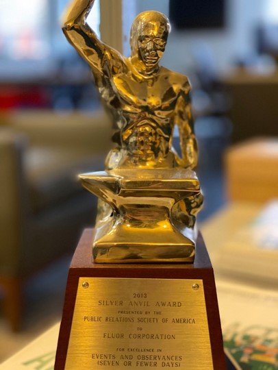
A gold statue on a wooden base

The Silver Anvil Award

I didn’t know what a big deal the Silver Anvil Award was until we won it in 2012. 

I’ve never been very interested in awards or self-congratulatory symbols; I prefer to let the work speak for itself. But this one means a lot. 

It was the Public Relations Society of America’s (PRSA) esteemed recognition for the mind-boggling amount of work Watts and its partners put into the Fluor Centennial event in 2012. 

For nearly four years, we travelled to six continents and produced over 100 videos. But aside from that, we creatively planned and executed a multi-national live event with satellite uplinks from Dallas to 20 simultaneous remote events, complete with aerial acrobats, a massive live orchestra, and a “living” construction video backdrop that helped change the game for what a live corporate event could be. 

This epic creative journey was my father’s last with the company, but it was sure a glorious way to go out.

A close up of an audio recorder

The Zoom H4N Audio Recorder

This little guy has been with us since the advent of the DSLR revolution. 

In 2009, we were one of the first companies to start using Canon 7Ds to shoot HD video. It was a huge breakthrough for us and eventually the rest of the video production industry. We could achieve incredibly cinematic looks by simply attaching still camera lenses that we already owned.  

Clients were stunned at the upgrade, as the variable lensing created an incredible amount of depth in the video imagery. 

In addition, the cameras were compact, cheap, and traveled extremely well requiring about 50% less baggage on shoots. The only drawback was the cameras had NO professional audio inputs. Many of you might remember the annoying winding clock sound that was embedded into the picture. 

That was obviously a huge problem if we were shooting an interview. 

So, we packed these little guys with us and synced the audio afterwards in post with Red Giant’s Pluralize. We still use these things today for home voiceover records. 

They do one thing, but they do it well. Being one of the first to deploy DSLRs on location shoots was a surprising profit center for the company; the imagery was fresh and superior in our client’s eyes, and it drastically lowered our “out of house” costs. 

We invested in the camera lensing rather than chasing every new model that flooded the market thereafter. 

Anybody remember Flip cameras?

Over the years, we’ve fought the temptation to let the “tail wag the dog” when it comes to buying new technology; you eventually learn that the impact is fleeting and too expensive to always chase the latest and greatest. 

In this case, being first was a home run for us and it helped set the tone for the efficient agile production that we’re known for today.  

You can check out some of our work here - https://www.wearewatts.com. Or you can send us an email through hello@wearewatts.com.

This article originally appeared in Shots.